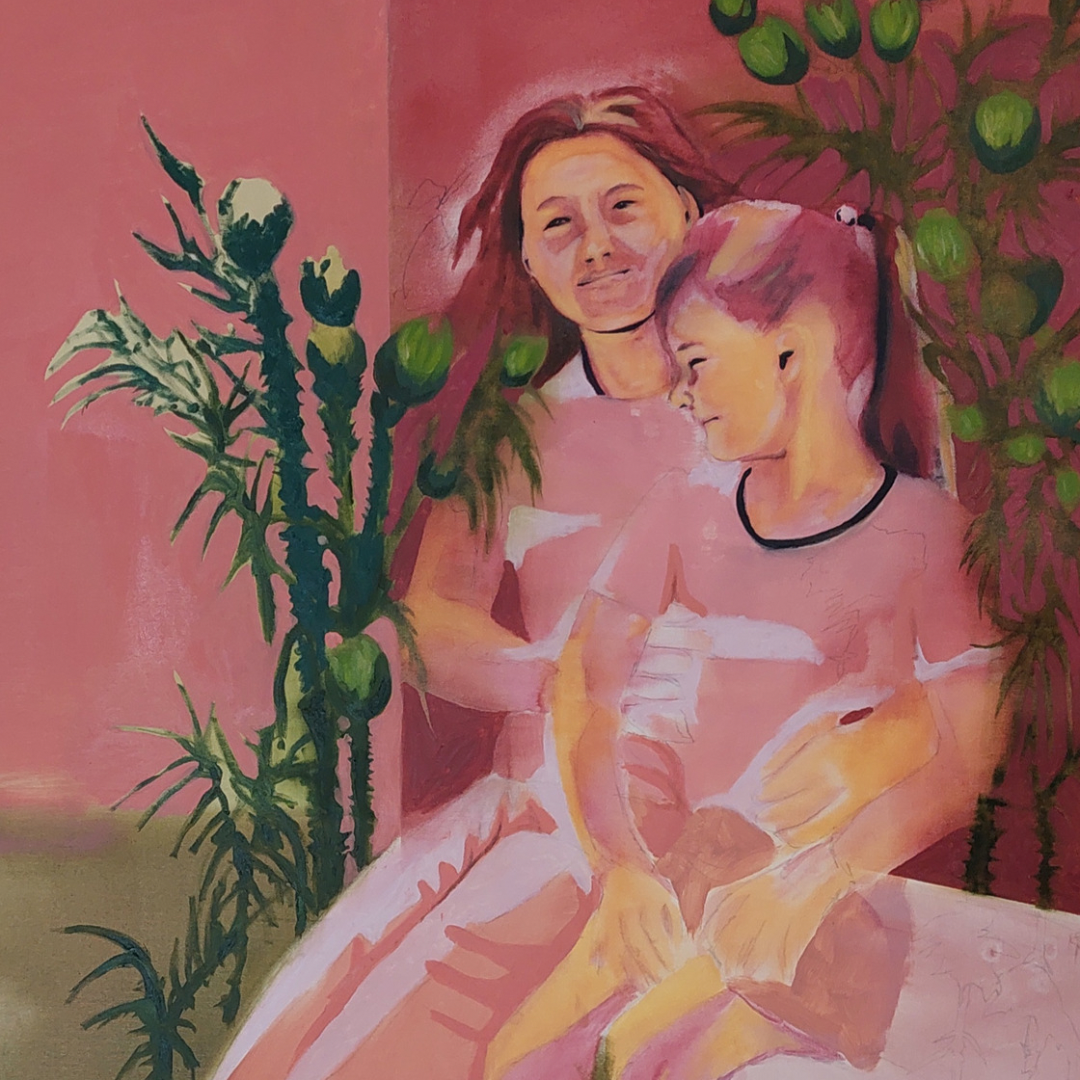
We focused on Greta’s work because she made a very interesting stylistic choice, mainly using only four colors and some resulting shades. She’s using oil paints for painting and charcoal and pencil for drawings.
As an artist, in fact, she represents a figurative imagery that comes to life from her memories and from her travels to the homeland of her family, Albania, where many buildings and symbols of its recent history remain.
Lately, the artist has been working much more on human figures, which, however, almost never assume connotations of recognizability or emotional manifestation, often the faces are very blurred or barely hinted at, as symbolic representatives.
Her works, therefore, are configured as a projection of her sedimented memory, which merges with what her gaze finds and recognizes as worthy of representation in the current state of things, giving us a unique and original vision, recognizable thanks to a very personal style.
IN DETAIL
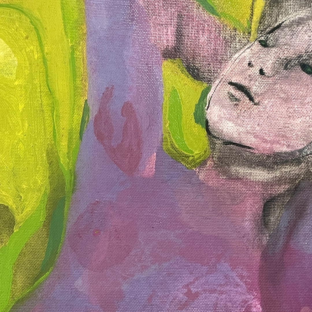
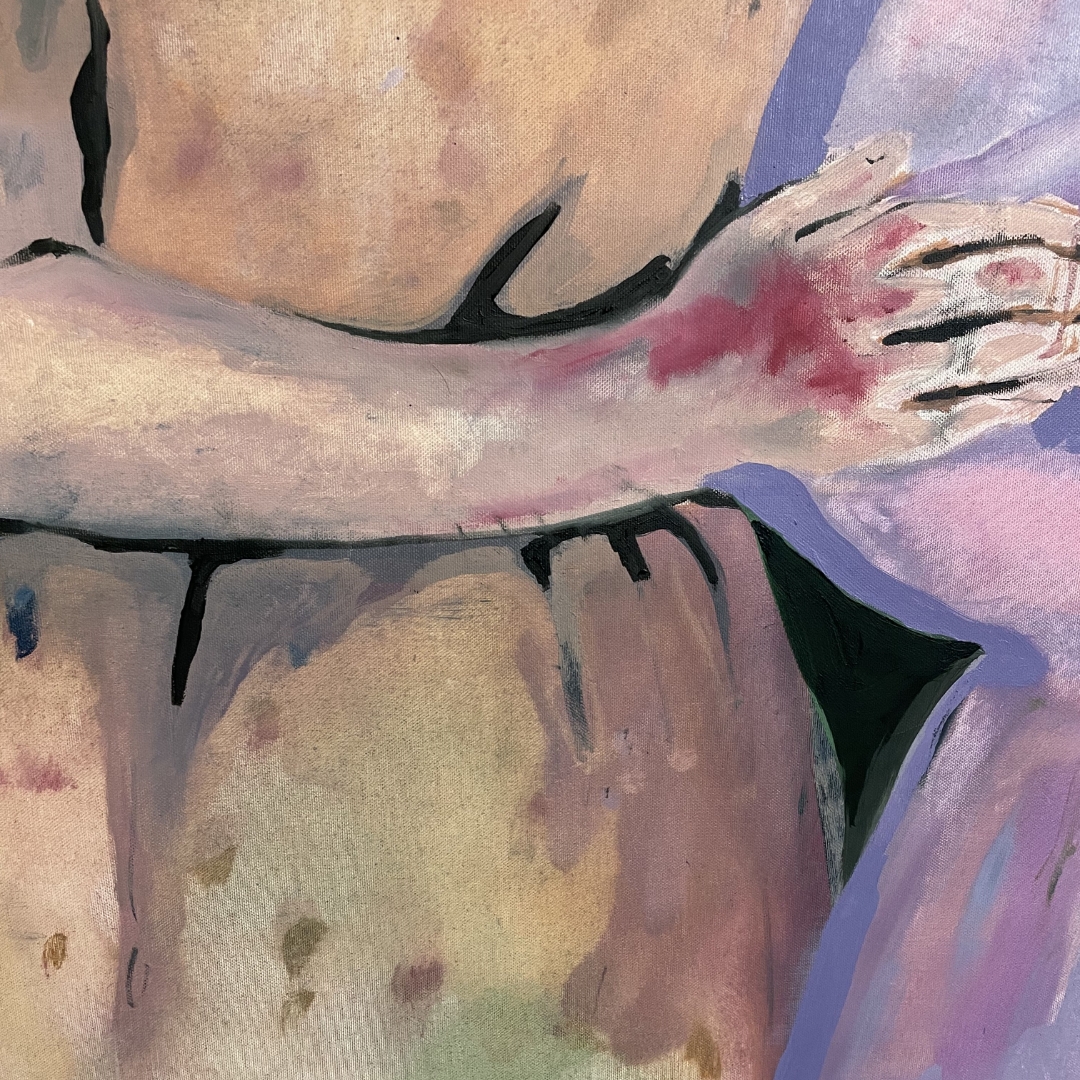
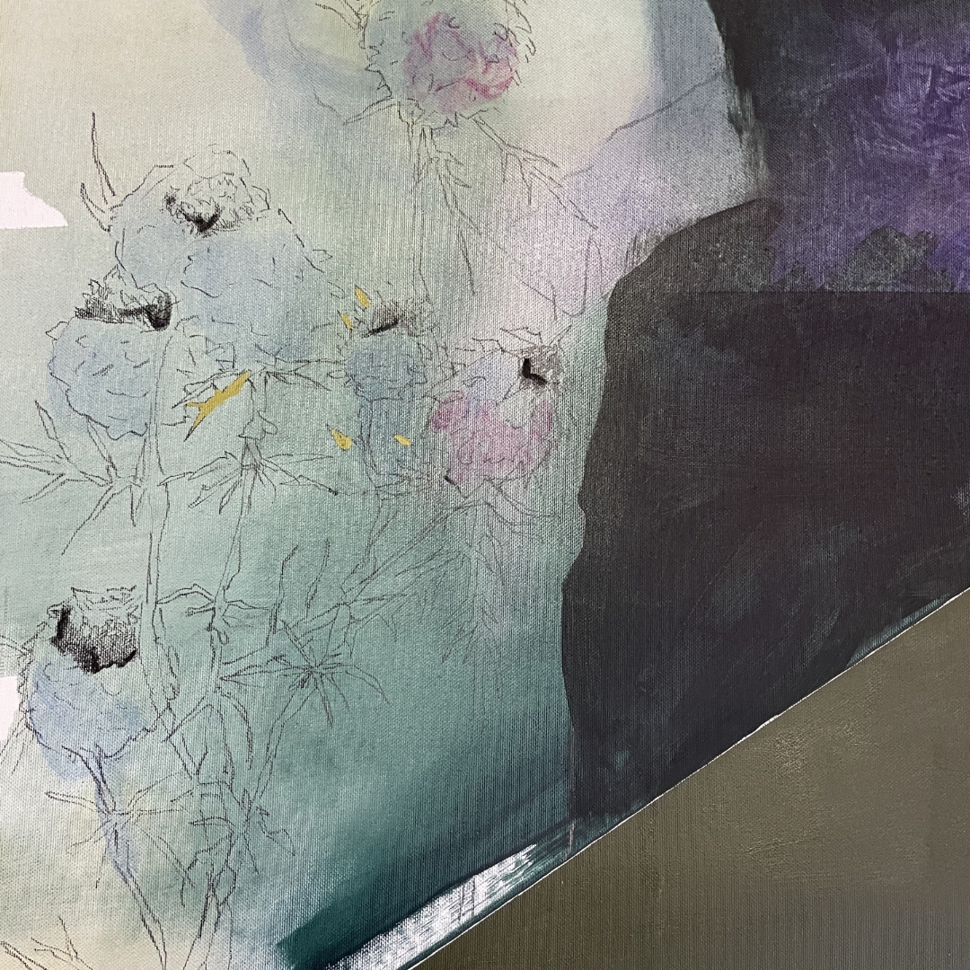
Looking at Greta's works in the studio and more closely, you can see the incredible effects she achieves by blending the colors she has chosen as representative of her aesthetic.
Thanks to a skilful use of the shading technique, she allows the depth and the right balance to be created between the figures and the architectures she paints and the light, also allowing the chromatic variegation of each single color to be expanded to the maximum.
Regarding the use of green, ocher and purple, the artist declares that they were introduced in the painting thanks to the influence that Venice and the lagoon had in her artistic path, places where she began to express herself with the canvases and to experiment.
As an artist, in fact, she represents a figurative imagery that comes to life from her memories and from her travels to the homeland of her family, Albania, where many buildings and symbols of its recent history remain.
Lately, the artist has been working much more on human figures, which, however, almost never assume connotations of recognizability or emotional manifestation, often the faces are very blurred or barely hinted at, as symbolic representatives.
Her works, therefore, are configured as a projection of her sedimented memory, which merges with what her gaze finds and recognizes as worthy of representation in the current state of things, giving us a unique and original vision, recognizable thanks to a very personal style.
IN DETAIL
Looking at Greta's works in the studio and more closely, you can see the incredible effects she achieves by blending the colors she has chosen as representative of her aesthetic.
Thanks to a skilful use of the shading technique, she allows the depth and the right balance to be created between the figures and the architectures she paints and the light, also allowing the chromatic variegation of each single color to be expanded to the maximum.
Regarding the use of green, ocher and purple, the artist declares that they were introduced in the painting thanks to the influence that Venice and the lagoon had in her artistic path, places where she began to express herself with the canvases and to experiment.